Discover the unexpected. Global campaign for 1800 Tequila taking a fresh look at their Art Direction, core design assets and giving new life to their visual identity.
As the World’s Most Awarded Tequila, 1800 wanted to reframe and elevate the perception of the agave spirit, from a shot to be had at the end of the night to a more refined and sophisticated drinking experience - to be savoured and deeply enjoyed.
ROLE
Snr Creative/AD/Design
CLIENT
1800 Tequila
AGENCY
BBH
Each of the images conjures a specific 1800 Tequila Moment that relates the brand to a fun, fascinating story that viewers can instantly project themselves into - moments of celebration, relaxation, anticipation, mystery and magic. The Art Direction harnesses the vibrant energy and cultural warmth of Mexico, imbued into the golden lighting, materials, textures, and patterns with an approach that is distinctly contemporary and avoids stereotypical depictions. The approach to colour celebrates the richness and warmth of Mexican culture, the fresh vibrance of the cocktails, and a touch of accessible luxury.

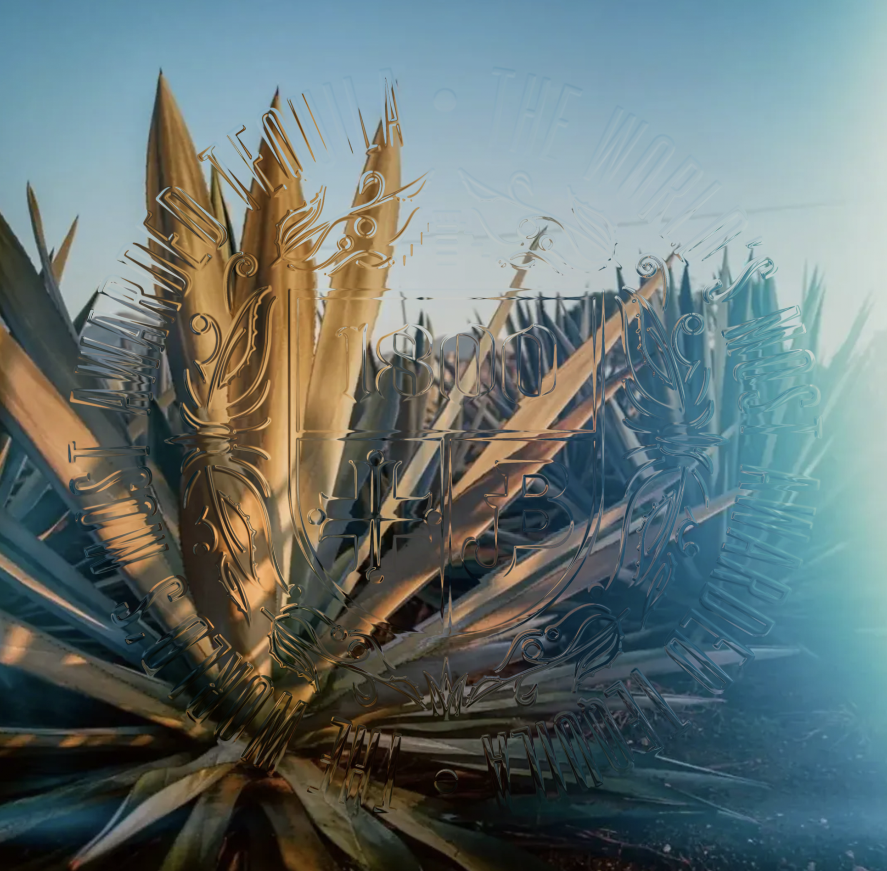
The lighting is inspired by the warmth and intensity of the Mexican sun at “golden hour” - flexing across the most appropriate time of the day for each drinking occasion, from early golden hour to late evening. Long deep shadows signal the coming coolness of evening, while caustic highlights focus and concentrate the sun’s lingering warmth.

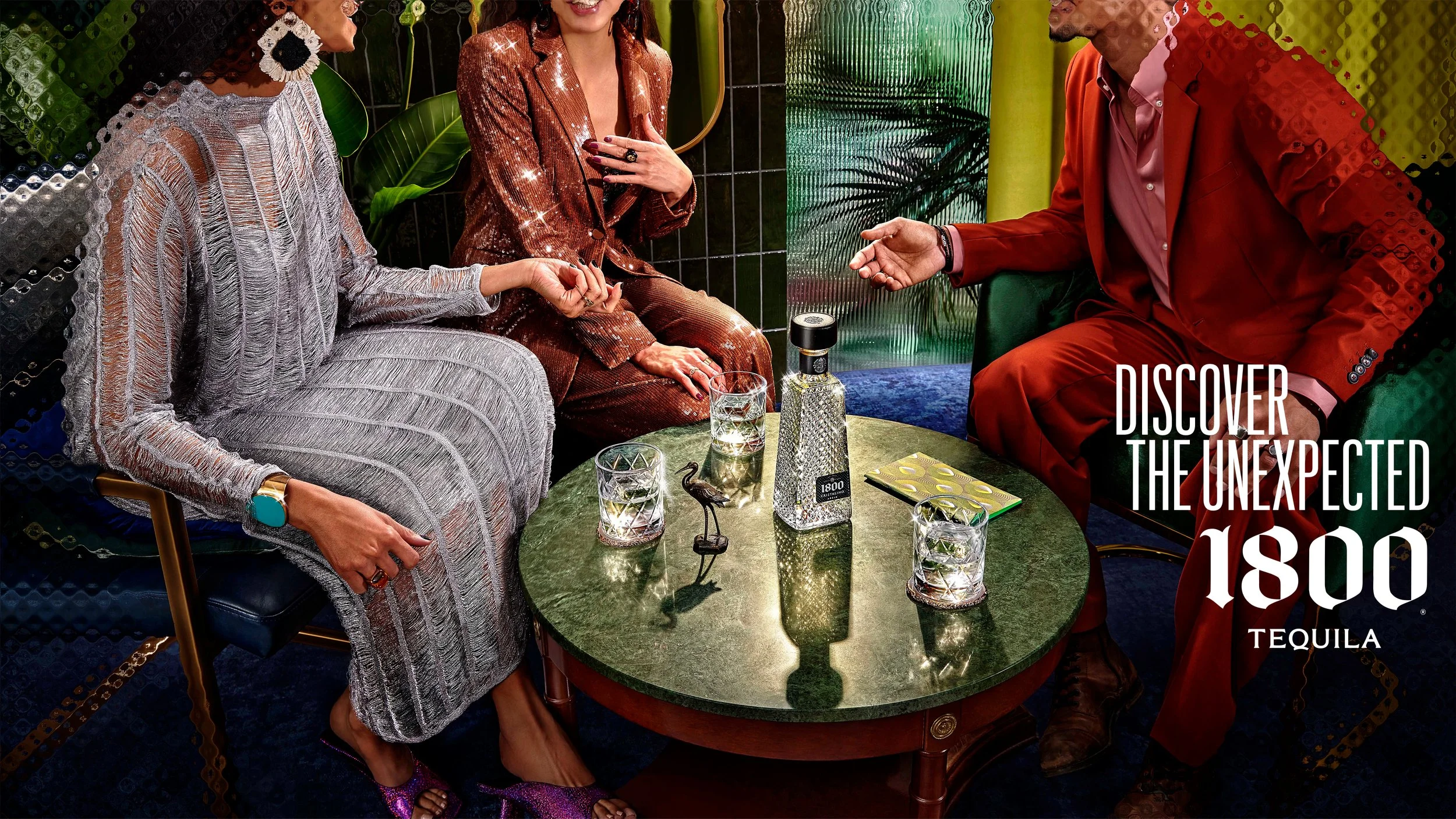
Each image is inspired by the product and the occasion, framed into carefully knitted storylines. There is always a sense of interaction between characters, a sense of a story that is unravelling just outside of frame. Beautifully styled serves always steal the scene, the protagonist of each shot. A few props are unobtrusively placed in each set, gluing the storytelling elements together and drawing the viewer into the narrative. Working with the talented photographers Les Garçon, we tried to visually express the flavour of each moment working with colour, composition, texture, the quality of light and intention of the talents. The result is a cohesive visual atmosphere that surrounds and supports the drinks and help the viewer ‘taste’ the flavour of the moment.


The refractive pattern is a visual device inspired by the intricate ornaments on high end cabinets, timeless cocktail glasses and sophisticated booth dividers. It works to focus the eye on the centre of each composition while playing with the refracted fragments of the story unravelling behind it. It then gently slipping away from the edges of the picture to form lucid frames that draw the viewer in.


A flexible grid system allows to move across formats without diluting the bold graphic approach or taking the shine away from the shots. The design approach borrows elements from the Art Direction and explores refraction and focus in the typographical world. The new Art Direction and design approach has been distilled into global guidelines for 1800 Tequila to be shared across all local markets.